Congratulations to Team UrbanFlow from NUS for winning the Excellence Award at ASEAN Geospatial Challenge 2026!
- Post by: Kowin Chen
- May 14, 2026
- Comments off
Congratulations to Ng Wan Qi Cheryl, Xie Yijia, and Zeng Zi Rui from Team UrbanFlow of NUS who have won the Excellence Award at ASEAN Geospatial Challenge 2026. Learn more here.
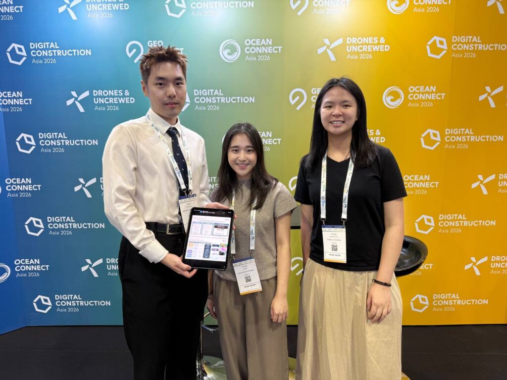
Photo Credit: Team
Project Title: Transit Comfort Dashboard
We have asked them a few questions about their project and here is their answer!
1. Can the team summarize what this project is about?
Our project contributed another way of thinking about transit. Instead of asking only, “What is the fastest route?”, we ask, “What is the most comfortable route for this commuter at this moment?”. The core idea is to rethink commuting as a comfort-driven spatial experience that could support more environment-aware commuting decisions. To create a transit comfort dashboard, we introduce a Transit Comfort Score from 0 to 100, based on four dimensions: crowd density, mall proximity, temperature, and rainfall.
2. What inspired the team to do a project about this topic?
The real-world commuting is influenced by more than just travel time. It is also shaped by environmental exposure, crowding, and access to comfortable nearby spaces. For instance, heat stress affects commuter behaviour, with extreme weather conditions like rain and heat prompting a shift towards public and private transport. Recent studies show that predictive and real-time mobility analytics can reduce up to 75% waiting time, and improve resource efficiency, allowing the commuting population to be served at a lower infrastructural cost. This value motivates us in developing a transit comfort dashboard that communicates real-time comfort conditions in an interactive model where commuters can readily interpret. We hope that our dashboard will assist commuters in adapting their journeys based on their comfort level and commuting preferences in a one-stop platform.
3. What was the most difficult part about this project?
Live data accuracy and flexible aesthetic adjustments to the dashboard interface were the key challenges of our project. A key challenge was computing thermal comfort from the density of weather stations available in the NEA dataset. The inaccuracy of values would increase with distance away from the weather stations due to uncertainties from interpolation. This creates difficulties in retrieving both accurate and continuous information in the areas with limited coverage of weather stations. Another key challenge to the project was the display of the live raster data using Mapbox, the map hosting service of choice.
4. Thinking back, are there ways the team could have done to make the project better?
With new skillsets gained in the current semester, we felt that this dashboard could have been better through the advanced web technologies like ArcGIS Maps SDK for JavaScript and deeper CSS integration. We also see the potential of incorporating participatory elements that could allow commuters to contribute their feedback directly to the dashboard.
5. Shout-outs or special mentions if any?
Special mention to Professor Luo Wei who provided encouragement and meaningful suggestions in order to bring this project forward.
Once again, congratulations to the winners!